By Sergey Tselovalnikov on 02 October 2023
Hey, Computer, Make Me a Font
This is a story of my journey learning to build generative ML models from scratch and teaching a computer to create fonts in the process. Yes, genuine true type fonts, with a capital-only set of glyphs. The model takes a font description as an input, and produces a font file as an output. I named the project 'FontoGen'.
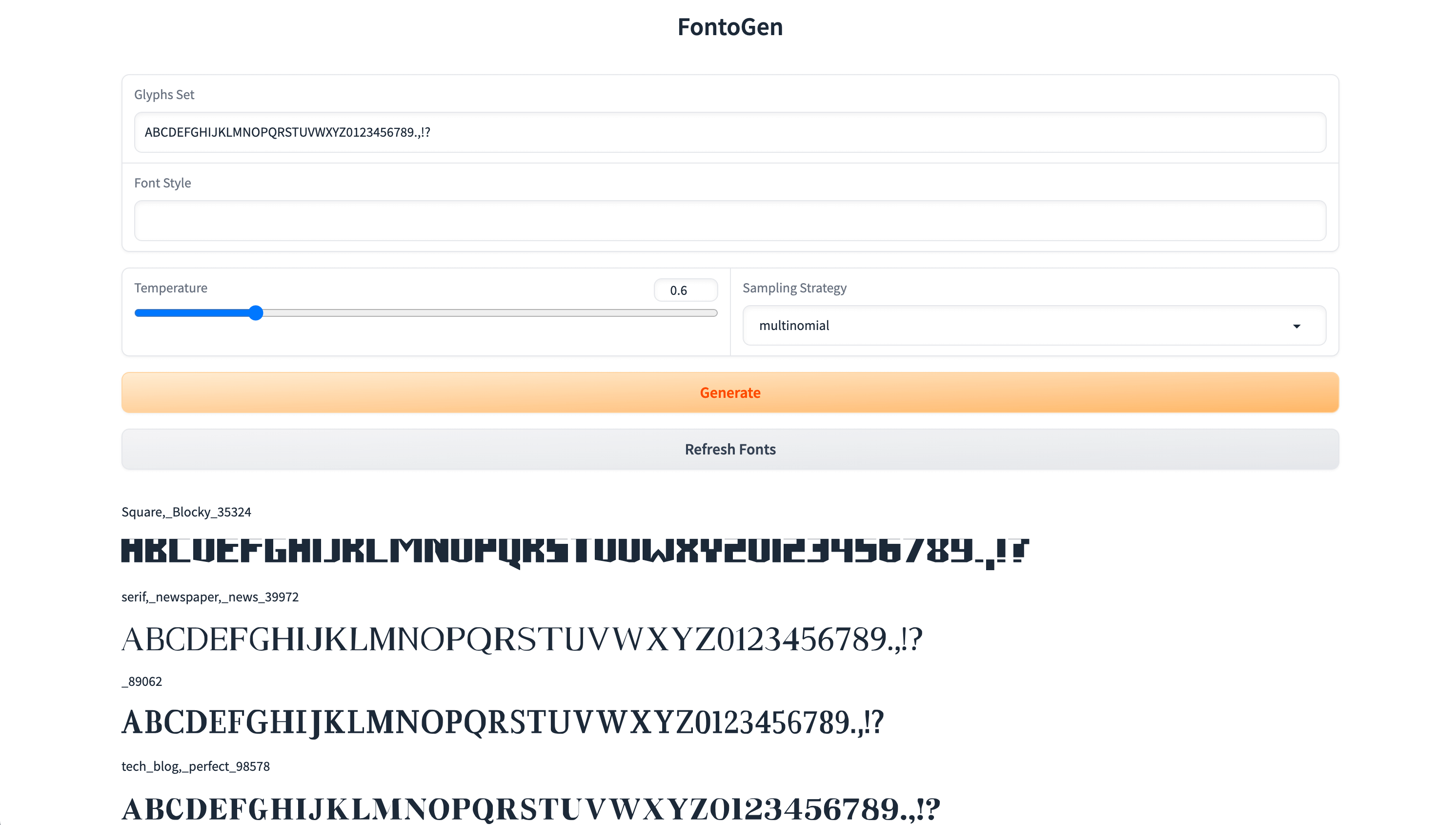
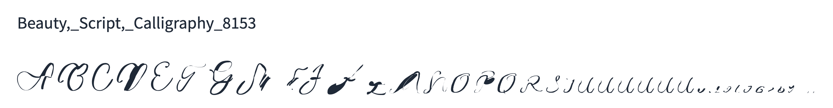
Here are a few examples of fonts generated by the FontoGen model:
bold, sans
THE QUICK BROWN FOX JUMPS OVER THE LAZY DOG?
italic, serif
THE QUICK BROWN FOX JUMPS OVER THE LAZY DOG!
techno, sci-fi, extrabold
THE QUICK BROWN FOX JUMPS OVER THE LAZY DOG.
If you want to learn the full story, keep reading.

I'm gonna go build my own theme park
Intro
At the beginning of 2023, when AI started creating ripples across the internet, like many others I became very interested in the topic. I was sucked into the world of making memes with Stable Diffusion, training LoRAs on my friends’ faces, and fine-tuning text-to-speech models to mimic famous voices.
At some point, I started looking at text-to-SVG generation which, as it turned out, is a much harder task compared to raster-based text-to-image generation. Not only is the format itself quite complex, it also allows for representing the exact same shape in many different ways. As I was interested in learning how to build a generative ML model from scratch, this became my weekend project.
The Idea
As I began exploring different ways to generate SVGs, I came across the IconShop2 paper which achieved pretty impressive results. It took me some time to reproduce them by building a model based on the description in the paper. After finally achieving close-enough results, I realised that the process of generating fonts could be similar to the process of generating SVGs, and started working on the project.
Compared to SVG images, fonts are both easier and harder to generate. The easier part is that fonts don’t have the colour component present in colourful SVG images. However, the harder part is that a single font consists of many glyphs, and all glyphs in a font must maintain stylistic consistency. Maintaining consistency turned out to be a significant challenge which I'll describe in more detail below.
The Model Architecture
Inspired by the SVG generation approach described in the IconShop paper, the model is a sequence-to-sequence model trained on sequences that consist of text embeddings followed by font embeddings.
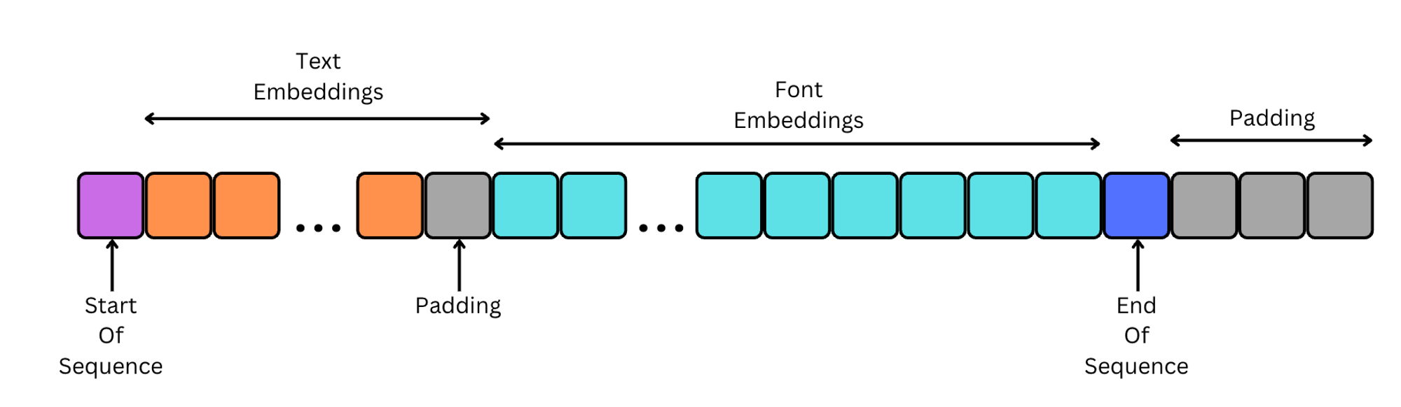
Text Embeddings
To produce text embeddings, I used a pre-trained BERT encoder model, which helps to capture the "meaning" of the prompt. The text sequence is limited to 16 tokens, which in BERT’s case roughly corresponds to the same number of words. While the text prompt could potentially be longer, memory constraints were a significant concern for my single-GPU setup. So, all textual font descriptions present in the dataset were summarised to a set of a few keywords with the help of OpenAI’s GPT-3.
Font Embeddings
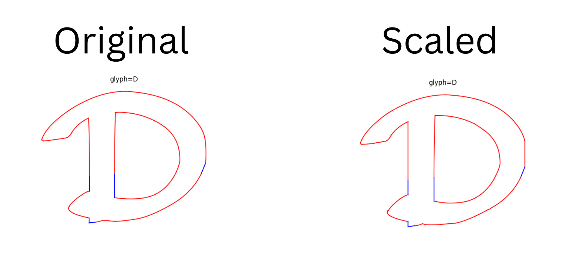
In order to produce font embeddings, the fonts first need to be converted to a sequence of tokens similar to how text is tokenised with the BERT tokeniser. In this project, I’ve only considered the glyph shapes and ignored the width, height, offset, and other useful metadata present in the font files. Each glyph was downsampled to 150x150 and normalised. I found that the 150x150 dimension preserves font features with minimal glyph deformation, which was more pronounced at lower resolutions.
I used Python’s fonttools to parse font files which can conveniently process each glyph as a sequence of curves, lines, and move commands, where each command can be followed by zero or more points. I decided to limit the glyph set to the following glyphs to get a minimal usable font.
ABCDEFGHIJKLMNOPQRSTUVWXYZ0123456789.,!?
The final model vocabulary needed to represent 22547 different tokens:
- 40 glyphs,
- 5 line path operations: moveTo, lineTo, qCurveTo, curveTo, closePath,
- 2 tokens to represent EOS (end of sequence) and PAD (padding),
- 150^2 = 22500 different points.
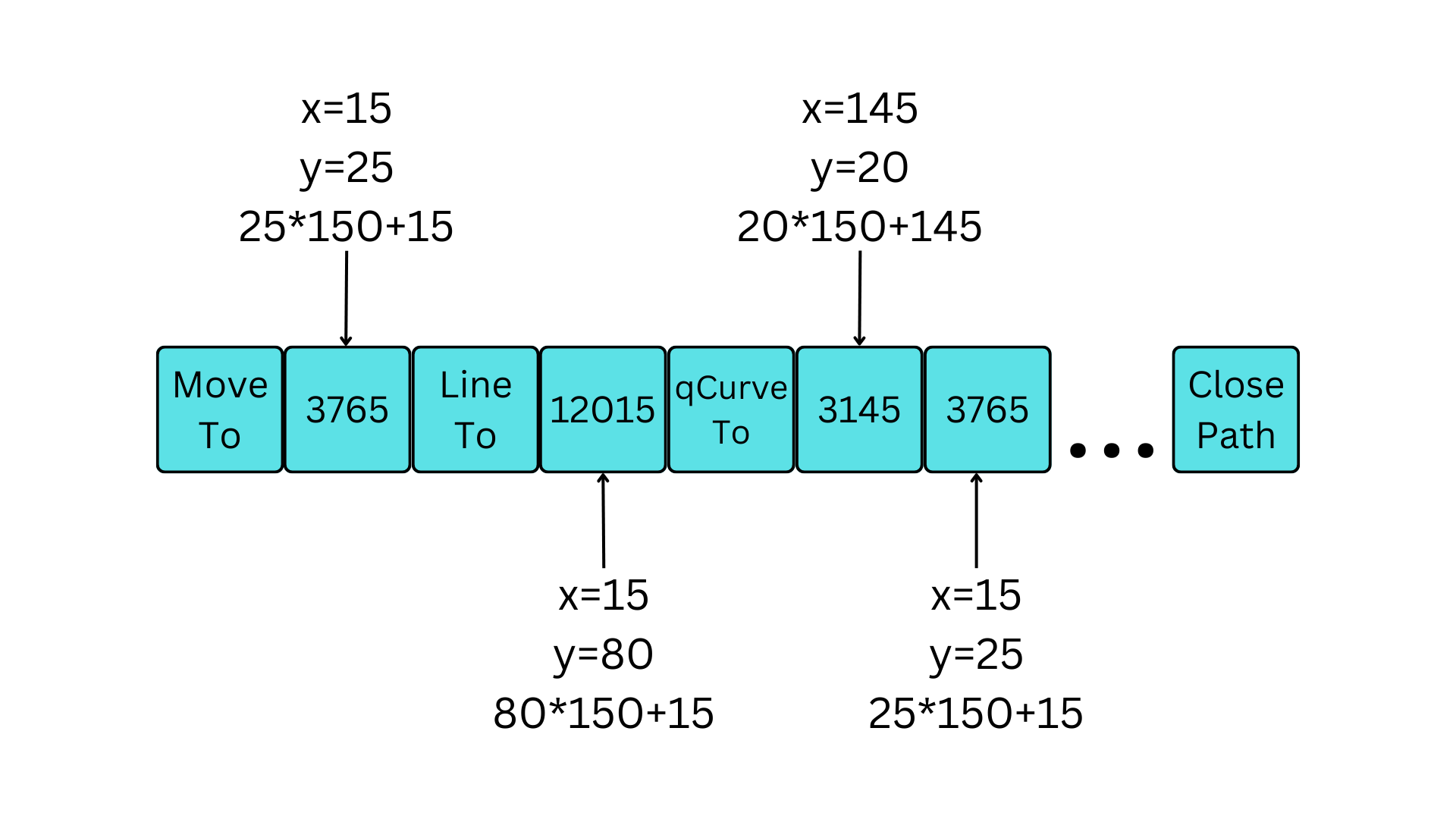
The token sequence is then converted into an embedding vector using learnable embedding matrices. Additionally, as proposed in the SkexGen1 paper, separate matrices were used specifically for x and y coordinates. And the final step was to apply positional embeddings.
Transformer
The model is an autoregressive decoder-only transformer consisting of 16 layers and 8 blocks. The model’s dimension is 512, resulting in a total of 73.7 million parameters.
  | Name  | Type     | Params
-----------------------------------
0 | model | Fontogen | 73.7 M
-----------------------------------
73.7 M    Trainable params
0         Non-trainable params
73.7 M    Total params
294.728   Total estimated model params size (MB)
I computed the loss using simple cross-entropy and disregarded the padding token.
Attention
Every time a part of the glyph is generated, several factors influence the decision on which token comes next. First, the model prompt affects the glyph’s shape. Next, the model needs to consider all previously generated tokens for that glyph. Finally, it needs to take into account all other glyphs generated so far to ensure consistency in style.
When doing initial experiments with only a handful of glyphs, I started with full attention. However, as the sequence length increased, this approach became impractical, prompting a shift to sparse attention. After exploring various options, I settled on BigBird3 attention. This approach supports both global attention, to focus on the initial prompt, and window attention, which observes N previous tokens, capturing the style of several preceding glyphs.
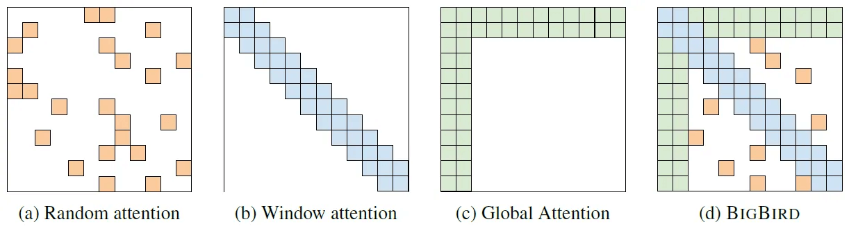
Given that a single glyph can have a variable number of tokens, I set the attention mechanism to consider at least the 3 preceding glyphs. While most of the time, the approach has been successful at preserving the overall font style, in some complex cases, the style would slowly drift into unrecoverable mess.
Training
To train the model, I assembled a dataset of 71k distinct fonts. 60% of all fonts only had a vague category assigned to them, while 20% fonts were accompanied by longer descriptions, so the descriptions were condensed to a few keywords using GPT-3.5. Additionally, I included 15% fonts where the prompt only contained the font's name, and the remaining 5% of the dataset had an empty textual description assigned to them to ensure that the model is capable of generating fonts with no prompt at all.
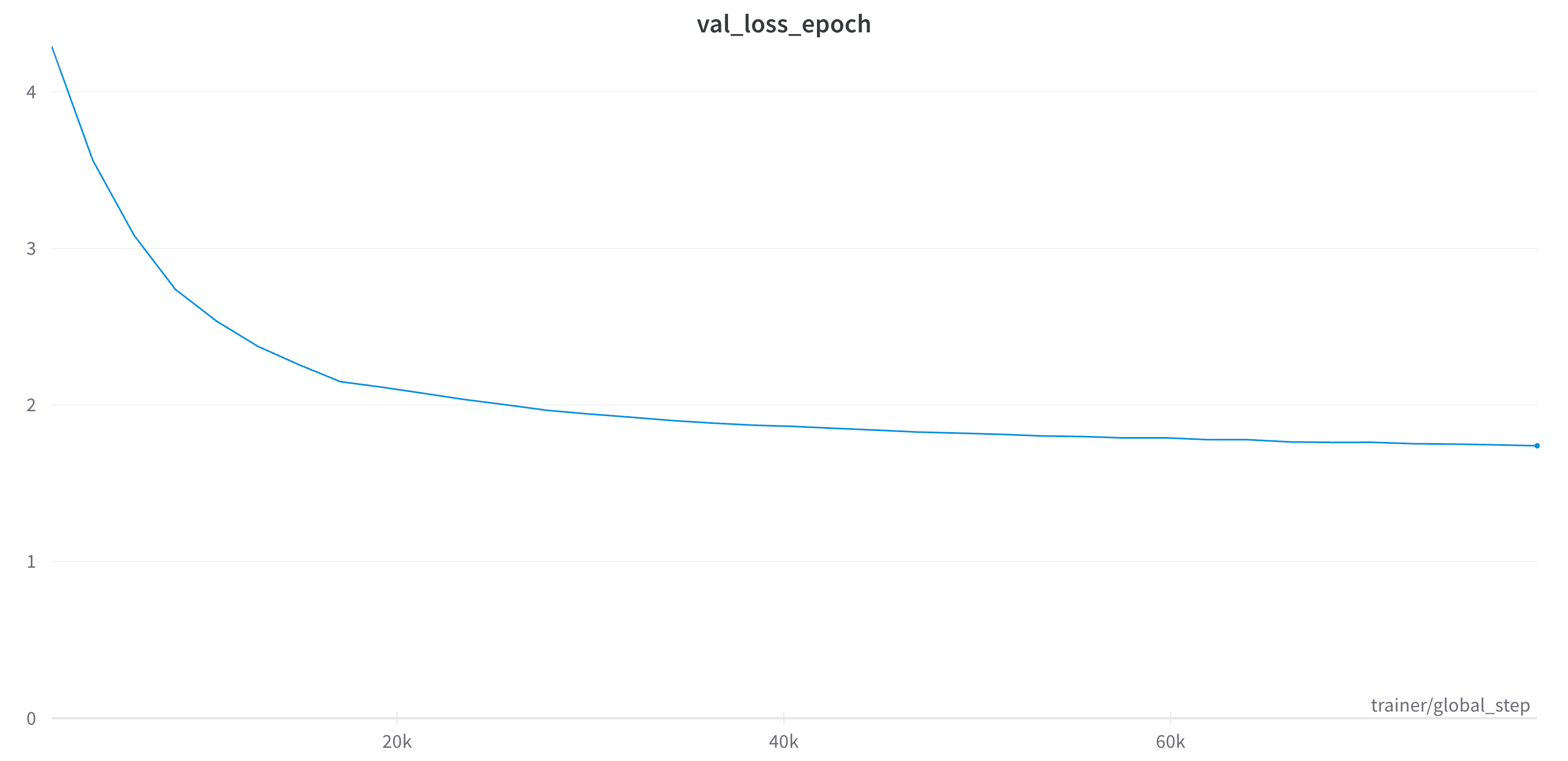
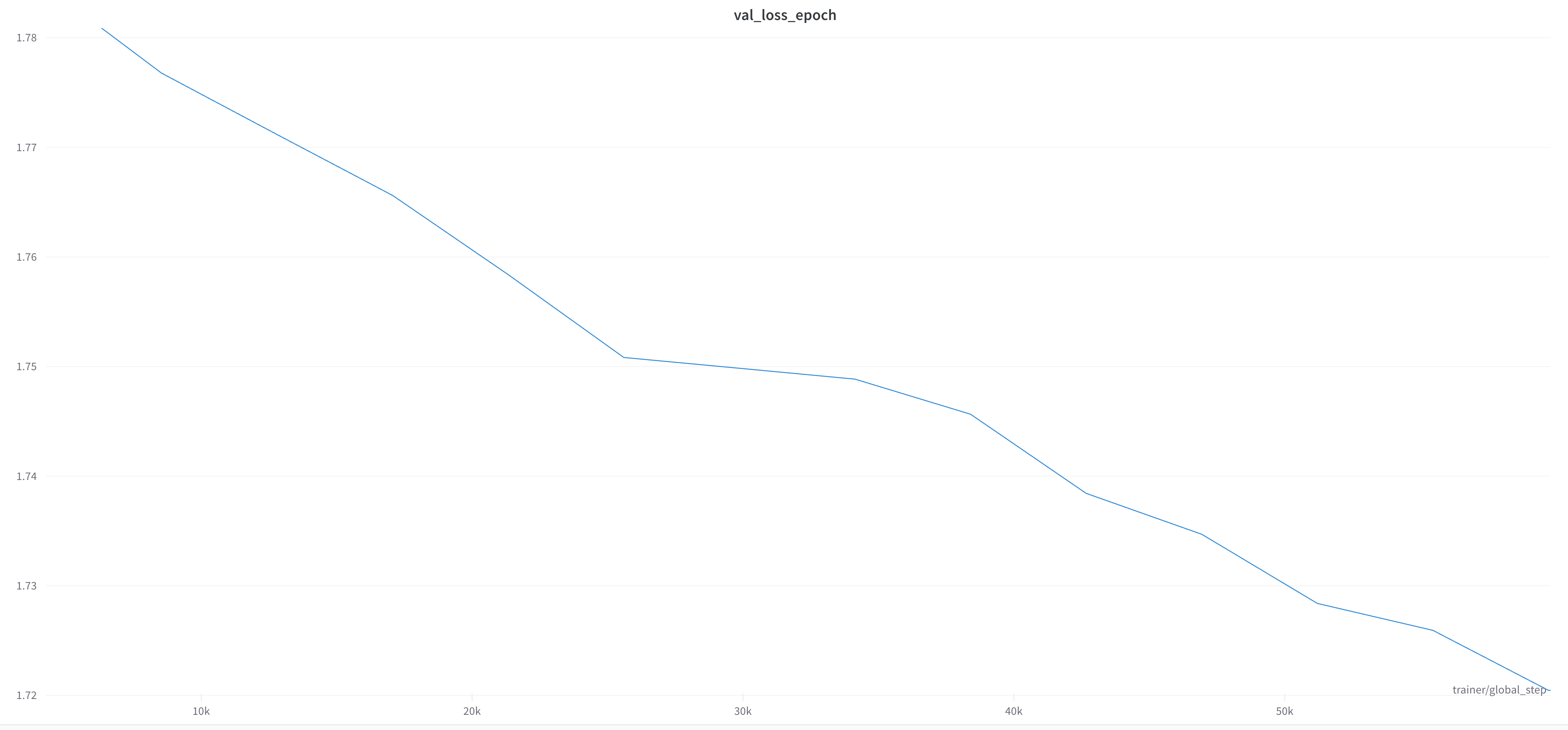
Due to large memory requirements, my Nvidia 4090 with 24G of VRAM could only fit two font sequences in a single batch, and I’d often observe gradient explosions. Using gradient accumulation and gradient clipping helped to resolve the issue. The model was trained for 50 epochs which took 127 hours. I restarted training once after 36 epochs, and kept training for another 14 epochs with reduced gradient accumulation. The training was stopped when the validation loss showed very little improvements.
Chasing Performance
Achieving good training performance was critical since I was training on a single GPU, and training took a significant amount of time.
- In the initial iteration, I processed font files and textual descriptions directly within the model on each step. While this codebase structure streamlined prototyping, it meant that the same tasks had to be repeated over and over again, making the training process slower. Additionally, having BERT loaded in memory meant that it would take up precious VRAM. By shifting as much as possible to the dataset preprocessing stage, I achieved a threefold performance boost.
- Originally, the model relied on huggingface's transformers. Migrating the code to xformers4 gave a very visible boost in speed and memory usage.
Instead Of Conclusion
I achieved what I set out to do – I learned how to build a generative transformer model, and built a project that's capable of generating fonts as a side effect. But there are so many things that I still haven't tried. For example, what if the model could be integrated into the existing font editors so that the font designer only creates a single glyph A, and all other glyphs are generated by the model. Or maybe the font editor could suggest the control points for bézier curves as they're being drawn! The horizon is vast, and there's much left to explore.
If you've read this article, and you think that I've overlooked something obvious, there's a good chance I did! I'm always keen to learn more, so please reach out and let me know what you think.
Thank you to
- Paul Tune for answering many questions I had about building transformer models.
References
- SkexGen: Autoregressive Generation of CAD Construction Sequences with Disentangled Codebooks
- IconShop: Text-Guided Vector Icon Synthesis with Autoregressive Transformers
- Big Bird: Transformers for Longer Sequences
- xFormers: A modular and hackable Transformer modelling library
Discuss on
Subscribe
I'll be sending an email every time I publish a new post.
Or, subscribe with RSS.